Page 1 of 3
*** Logo Vote for HIN Booth Banner ***
Posted: Mon Aug 16, 2004 2:24 pm
by andysapp

We will definitely put the URL inderneath whatever is chosen,
so no worries from that end.
Speak now or forever slide your drift.
Posted: Mon Aug 16, 2004 2:26 pm
by jo
ok i like the FOERST two but could only vote for one. the seal is way overkill.
Posted: Mon Aug 16, 2004 2:27 pm
by CodyW
damn...so many cool choices (the new circle one is cool by the way!)
i'm almost leaning towards the old english with the site address in the normal logo (just like in the center of the circle one) though, that looks good.
Posted: Mon Aug 16, 2004 2:56 pm
by andysapp
nobody wrote:ok i like the FOERST two but could only vote for one.
I like the FOERST two as well. Hell, I guess I like them all, since I made them.
I've grown partial to the oldEnglishe.
nobody wrote:the seal is way overkill.
That was my intention!!! Overkill rules.
Posted: Mon Aug 16, 2004 2:56 pm
by andysapp
CodyW wrote:
i'm almost leaning towards the old english with the site address in the normal logo (just like in the center of the circle one)...
I think that's a great idea!
Posted: Mon Aug 16, 2004 3:03 pm
by CodyW
cool

.
now we just need a pirate...i'll try to make a thread for that in a sec

.
Posted: Mon Aug 16, 2004 3:24 pm
by Drew@blitzkriegmedia
The FOERST one. The second one is nice, but it doesn’t stand out enough. The FOERST one grabs your attention, like grabbing a dude by the..... well you know what mean

Posted: Mon Aug 16, 2004 4:55 pm
by andysapp
Hahaha...

I agree with you... FOERST one does grab ya... somewhere, lol!
Posted: Mon Aug 16, 2004 5:24 pm
by djdorifto
Number 4 is dick, plain and simple and just plain dick =D
I'd rock that seal thou
Posted: Tue Aug 17, 2004 2:50 pm
by Rhoad Racing
i've always been partial to number 4. but I too like the old english style. So perhaps we could use #4 for HIN and then reprint the banner in Old English for Ninja/Pirate battle.

Sure it'll cost more, but yay, it's only like 40 bucks.
$.02
Posted: Tue Aug 17, 2004 3:57 pm
by Rhoad Racing

18"x48"
do ya'll like this simple look or should we add some flair!?
Posted: Tue Aug 17, 2004 4:13 pm
by jo
simple is good.
Posted: Tue Aug 17, 2004 4:18 pm
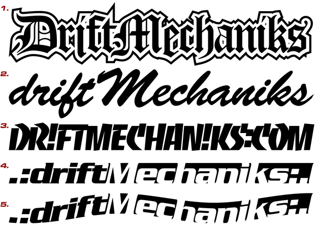
by CodyW
my only suggestion would be to use the traditional logo for the address, something like this...

Posted: Tue Aug 17, 2004 4:47 pm
by djdorifto
cody i love that one! am saving this =D
Re: *** Logo Vote for HIN Booth Banner ***
Posted: Tue Aug 17, 2004 4:55 pm
by darkducati
I am with Cody on this one.
And this is awesome. I would have had this at my wedding had I been clever enough to think of it!
andysapp wrote:
Speak now or forever slide your drift.